How to Choose a Color Palette for Vintage Decor?
Vintage decor transcends mere trendiness; it embodies a celebration of history and personal expression.
This guide will walk you through the essential elements of vintage style, highlighting its distinctive characteristics and helping you choose the perfect color palette. Consider how your existing furniture, lighting, and personal tastes shape your choices.
You ll uncover popular color palettes that evoke a sense of nostalgia, complemented by practical tips for achieving a cohesive look. Prepare to transform your space into a charming vintage haven!
Contents
- Key Takeaways:
- Understanding Vintage Decor
- Factors to Consider when Choosing a Color Palette
- Discover Vibrant Color Palettes for Vintage Decor
- Tips for Creating a Cohesive Color Scheme
- Frequently Asked Questions
- What color palettes work best for vintage decor?
- How should I incorporate accent colors into my vintage color palette?
- What should I consider when choosing a color palette for vintage decor?
- Can I mix and match different color palettes in my vintage decor?
- Are there any color palettes that should be avoided for vintage decor?
- Can I use a monochromatic color scheme for vintage decor?
Key Takeaways:
- Understand the defining characteristics of vintage decor before choosing a color palette.
- Consider the existing furniture, lighting, and personal preferences when selecting colors.
- Popular color palettes for vintage decor include soft pastels, bold jewel tones, and neutral earth tones.
Understanding Vintage Decor
Understanding vintage decor means appreciating the unique aesthetic and emotional resonance it brings to your spaces, seamlessly blending history with your personal style. This interior design approach incorporates various characteristics, such as color palettes, textures, and furniture styles, while cultivating an inviting atmosphere filled with warmth and personality.
Vintage decor brings nostalgia to life, making it a compelling choice for homeowners who want to create harmonious environments that reflect individuality. By skillfully selecting vintage accessories, patterns, and tones, you can transform your living space into a beautiful haven that tells a story uniquely your own. To achieve this, learn how to mix fabrics in vintage decor.
Defining the Style and Characteristics
Vintage decor is a delightful fusion of styles, colors, and patterns that transport you to a realm of nostalgia and timeless charm.
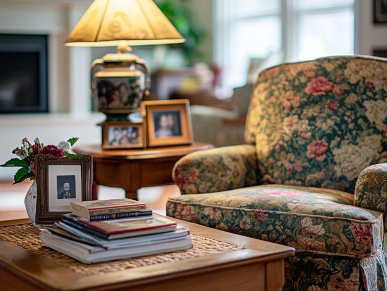
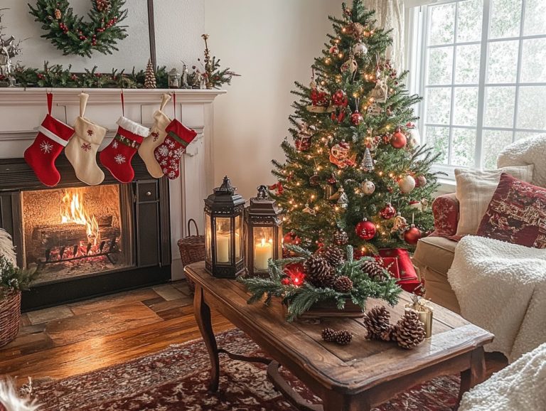
This aesthetic draws inspiration from a rich tapestry of eras, from the elegance of the Victorian period to the playful spirit of the 1960s and the rustic allure of farmhouse style. In your vintage spaces, you’ll likely encounter rich jewel tones like deep greens, burnt oranges, and royal blues, harmoniously paired with soft pastel shades that foster a warm, inviting atmosphere. Additionally, considering the impact of light color in vintage decor can enhance the overall aesthetic and mood of your space.
Patterns are essential in this aesthetic; floral motifs, geometric prints, and intricate damasks weave an intricate visual narrative that enhances both the beauty and emotional depth of your surroundings. Together, these elements create a narrative that connects you to the past, transforming your space into a personal sanctuary that celebrates both history and character.
Factors to Consider when Choosing a Color Palette
When selecting a color palette for your vintage decor project, carefully consider various factors that can influence the feeling and balance of your space. Assessing your existing furniture and decor elements is crucial, as is understanding how natural lighting interacts with your chosen shades and tones.
Your personal preferences and thematic goals will significantly guide you in finding the right color combinations that resonate emotionally and create a cohesive look throughout your rooms. By blending vibrant and soothing colors and incorporating accessories and patterns, you can achieve a visually striking and inviting atmosphere that truly reflects your unique style.
Existing Furniture and Decor
When choosing a color palette, it’s crucial to consider the existing furniture and decor in your space, as they play a significant role in shaping the overall design aesthetic.
Take stock of the styles, patterns, and hues already present; these established elements provide a solid foundation for your new selections. Begin by evaluating the dominant colors in your furniture, upholstery, and wall art. Pay attention to any shades that resonate with you emotionally or align with your vision.
Think about how new colors can either enhance or contrast these components, creating a harmonious atmosphere throughout the room. A color wheel can be a valuable tool for identifying complementary tones, while swatches will help you visualize how fresh colors interact with your existing decor.
This thoughtful approach reinforces your design intentions and ensures a cohesive look that beautifully reflects your personal style.
Start your vintage decor journey today! Share your experiences and let your creativity shine.
Brighten Your Space: The Power of Lighting
The significance of lighting in creating the perfect ambiance for your vintage decor cannot be overstated.
Consider how natural light influences color perception. During the golden hour, it beautifully enhances warm tones, while midday light brings a vibrant edge to cooler shades. Positioning mirrors strategically can reflect this natural light, making your spaces feel more expansive and inviting.
Layering artificial lighting can elevate color richness. Think warm LED bulbs, pendant lights, and table lamps. Soft, diffused lighting creates a tranquil environment, while brighter, direct lighting injects energy into the space. Employing these techniques elicits specific emotional responses that align seamlessly with the vintage aesthetic, crafting an atmosphere brimming with warmth and nostalgia.
Choose Your Vibe: Personal Preferences and Theme
Your personal preferences and the themes that guide your decor choices play a crucial role in shaping your color palette.
As you curate your living space, consider how your unique tastes can guide your selection of colors. Whether you’re aiming for a warm and inviting atmosphere or a more eclectic and vibrant vibe, each choice reflects your feelings and emotional responses.
For example, softer pastels evoke nostalgia and serenity, while bolder hues ignite excitement and energy. By aligning your color palette with your emotional landscape, you enhance the aesthetic appeal of your space and create a harmonious environment that resonates with your identity.
Discover Vibrant Color Palettes for Vintage Decor
Exploring popular color palettes unveils an array of options designed to cater to your unique style, emotions, and preferences. This ensures that every room achieves the atmosphere you envision.
Imagine soft pastels evoking tranquility, contrasting beautifully with bold jewel tones that command attention. The choices are as varied as the personalities of those who select them.
Neutral earth tones offer a lovely foundation for showcasing cherished heirloom pieces, fostering a cozy ambiance. Each palette invites you to unleash your creativity, blending shades and incorporating accents to craft a harmonious and visually captivating space.
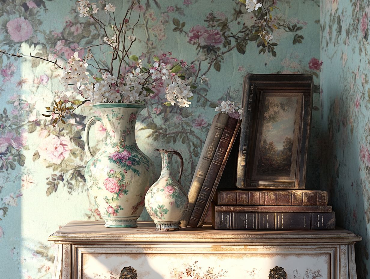
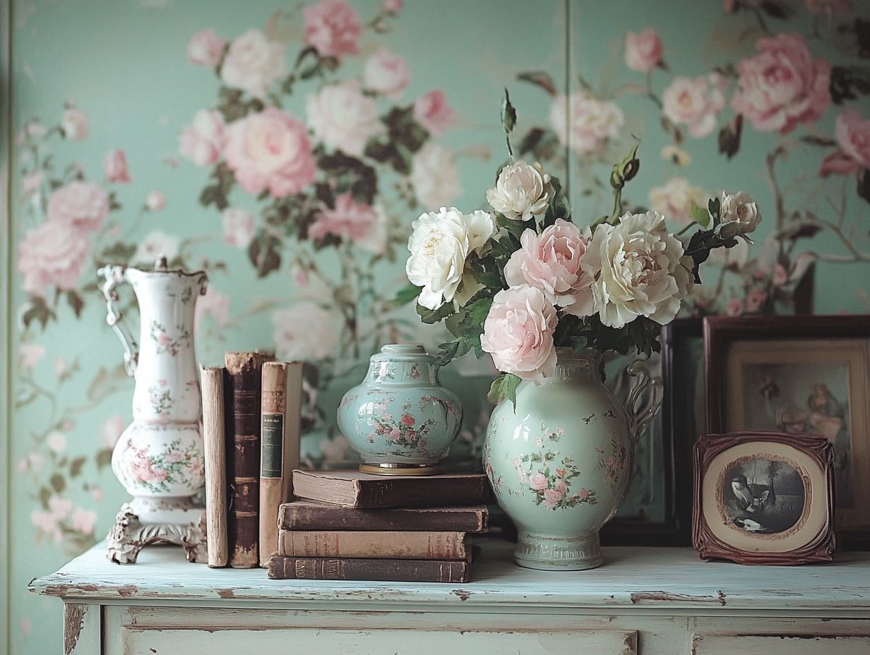
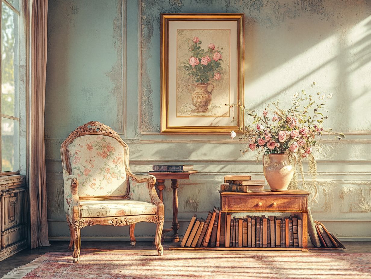
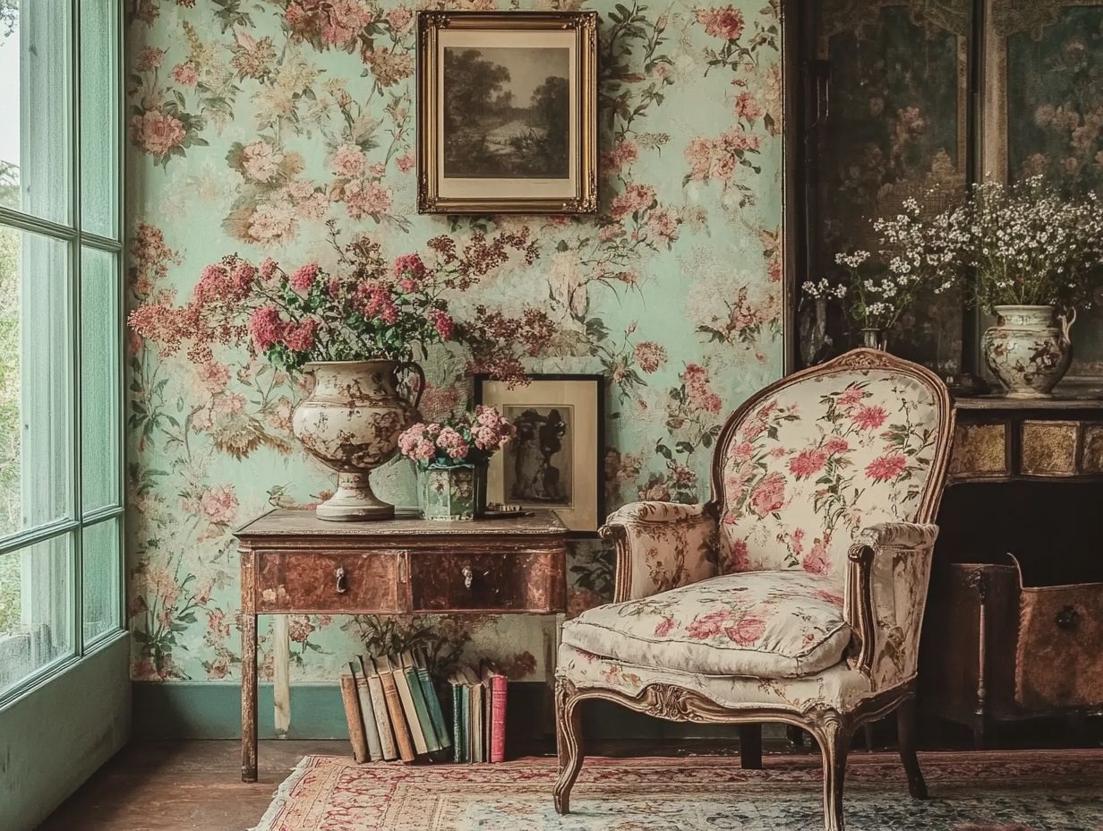
Soft Pastels and Floral Accents
Soft pastels, often complemented by floral accents, cultivate a delicate and soothing ambiance ideal for vintage decor.
These gentle hues think blush pinks, light blues, and soft yellows work in perfect harmony with nature-inspired patterns, evoking nostalgia and warmth. To infuse these colors into your living space, start with a neutral base. Then, layer in pastel textiles like plush cushions or flowing curtains. To learn more about how these colors contribute to vintage aesthetics, explore what vintage home decor color schemes are and include floral artwork or wallpaper to elevate the vintage charm.
To maintain a cohesive look, balance bold floral prints with muted pastel shades, ensuring each piece complements the others. This approach fosters a serene environment that invites both relaxation and appreciation of the design’s rich detail.
Bold Jewel Tones and Metallics
Bold jewel tones paired with metallics present a striking choice for vintage decor, offering a rich tapestry of color that commands attention and admiration.
This dynamic combination creates a luxurious ambiance, seamlessly blending the warmth of deep emerald greens and sapphire blues with the shimmering allure of golds and silvers.
Integrating these vibrant hues into your vintage spaces evokes a sense of opulence without overwhelming the room. To maintain balance, introduce softer elements like creamy neutrals or pastel textures through upholstery, drapery, or decorative accessories. For more ideas, explore how to use vintage colors in outdoor decor. These subtler tones will highlight the bold colors while providing visual relief, ensuring that your overall design remains cohesive and inviting.
Ready to transform your space? Dive into these palettes and create your vintage haven!
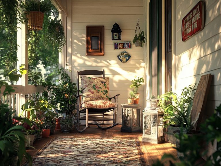
Neutral Earth Tones and Natural Textures
Neutral earth tones paired with natural textures bring warmth and balance to vintage decor. This combination is an exceptional choice for any room.
Muted shades, from soft beige to deep olive green, evoke tranquility and comfort, fostering an inviting ambiance. Incorporate elements like reclaimed wood, linen, and jute to elevate your space!
Integrate textured textiles such as woven throws or patterned cushions in earth-toned hues. They blend seamlessly with vintage furniture and contemporary accents.
Thoughtfully combining these colors and materials creates a harmonious environment that invites relaxation while showcasing timeless charm.
Tips for Creating a Cohesive Color Scheme
A cohesive color scheme is essential in vintage decor. It ensures that all elements work harmoniously together, crafting an appealing atmosphere that reflects your personal style.
Using a color wheel is immensely helpful in identifying complementary colors that enhance your space’s overall aesthetic. Consider the balance of tones, shades, and patterns to achieve a seamless blend of colors.
Whether you choose contrasting hues or matching tones, a well-planned color scheme elevates your vintage decor project and makes it visually appealing.
Using a Color Wheel and Complementary Colors
A color wheel is your secret weapon for selecting complementary colors that enhance your vintage decor projects. Understanding how colors interact elevates the visual appeal of any space!
Imagine a striking pairing of teal and coral breathing life into a room adorned with antique furniture. This combination creates a lively yet harmonious atmosphere.
Incorporating soft pastel hues alongside bold accents draws attention to vintage elements, making them stand out. Experiment with shades that complement each other for a balanced aesthetic.
Pair vintage floral wallpaper with modern muted colors or select furnishings that echo the room s primary color for a cohesive look that reflects your personal style.
Incorporating Patterns and Prints
Incorporating patterns and prints into your vintage decor elevates your space. This addition adds depth and interest to your color scheme, making it feel more dynamic.
Choose patterns like florals, geometric designs, or damasks to evoke nostalgia while creating visual intrigue. Vintage florals soften a room s look, infusing it with a romantic ambiance.
Geometric patterns introduce a dash of modernity, bridging the gap between past and present styles. Harmonize these designs with your existing palette!
Use accent pieces or textiles in complementary shades to unify the overall look. Patterns can serve as focal points, guiding the eye and enriching the historical narrative of your space.
Frequently Asked Questions
What color palettes work best for vintage decor?
Some color palettes that work well for vintage decor include:
- Warm earthy tones like mustard yellow, burnt orange, and olive green
- Muted pastel shades such as blush pink, baby blue, and sage green
Explore these palettes to find the perfect fit for your vintage decor!
Start transforming your space with these tips today. Share your vintage decor experiences with us!
How should I incorporate accent colors into my vintage color palette?
Accent colors add vibrancy to your vintage palette. Use shades of red like burgundy or maroon. Metallics such as gold or bronze work well too. Incorporate these colors through small decorative items, like throw pillows and wall art.
What should I consider when choosing a color palette for vintage decor?
Think about the era or style you want to evoke. For example, a 1920s art deco theme calls for bold geometric patterns and rich jewel tones.
In contrast, a 1950s mid-century modern look features clean lines and bright, saturated colors.
Can I mix and match different color palettes in my vintage decor?
Yes, mixing and matching color palettes can add visual interest and depth to your space. Choose colors that complement each other to maintain a cohesive look.
Are there any color palettes that should be avoided for vintage decor?
Avoid extremely bright or neon colors as they can clash with vintage aesthetics. Limiting the use of black and white is wise; they can sometimes feel too modern.
Can I use a monochromatic color scheme for vintage decor?
Absolutely! A monochromatic scheme, using different shades of the same color, creates a cohesive and elegant look.
Try shades of cream, beige, and brown for a warm, inviting palette.